BMO Credit: Redesigning for Clarity
Optimizing BMO’s credit card selection by transforming a high-friction layout into a transparent, decision-first experience.
Disclaimer: This case study is an independent, educational design exercise and is not affiliated with, endorsed by, or sponsored by BMO.
Project overview
Scope:
Product Design, UX Design, UX Writing
Tools:
Figma
Problem:
A high-friction layout that hid income requirements and made card comparison an exhausting task for users.
Solution:
A scalable, modular redesign that emphasizes transparency and simplifies the decision-making process through strategic placement.
Problem: A Confusing & Inefficient Experience
As a personal challenge, I audited BMO’s credit card marketing site to identify opportunities for a more intuitive digital banking experience. While my full exploration covers a redesign of several key sections of the landing page this case study focuses specifically on the Credit Card Selection Section.
I chose to deep-dive into this component because it represents a high-stakes moment for the user. My goal was to take a high-friction, data-heavy section and transform it into a transparent tool that empowers users to choose the right financial product with absolute confidence.
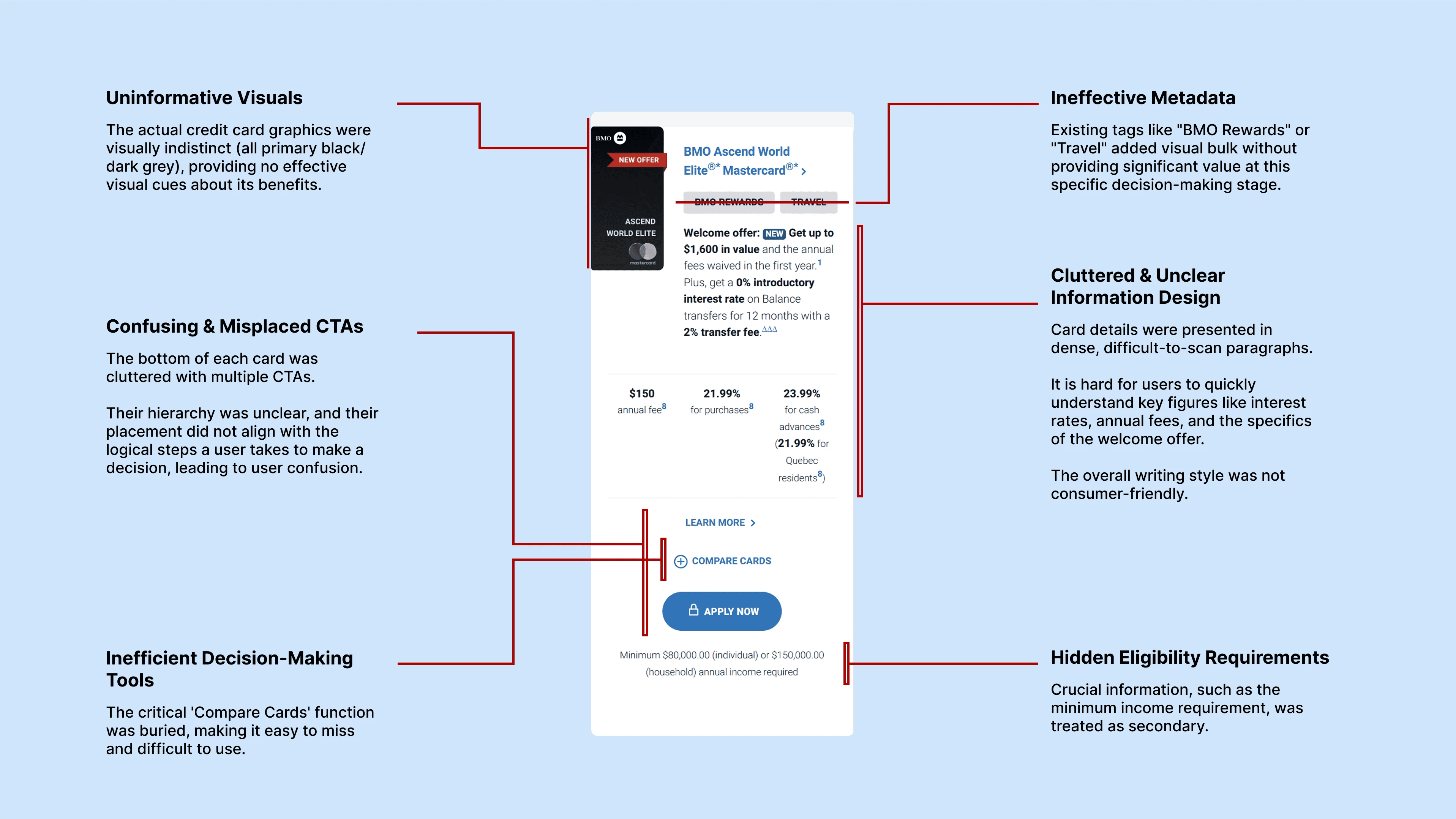
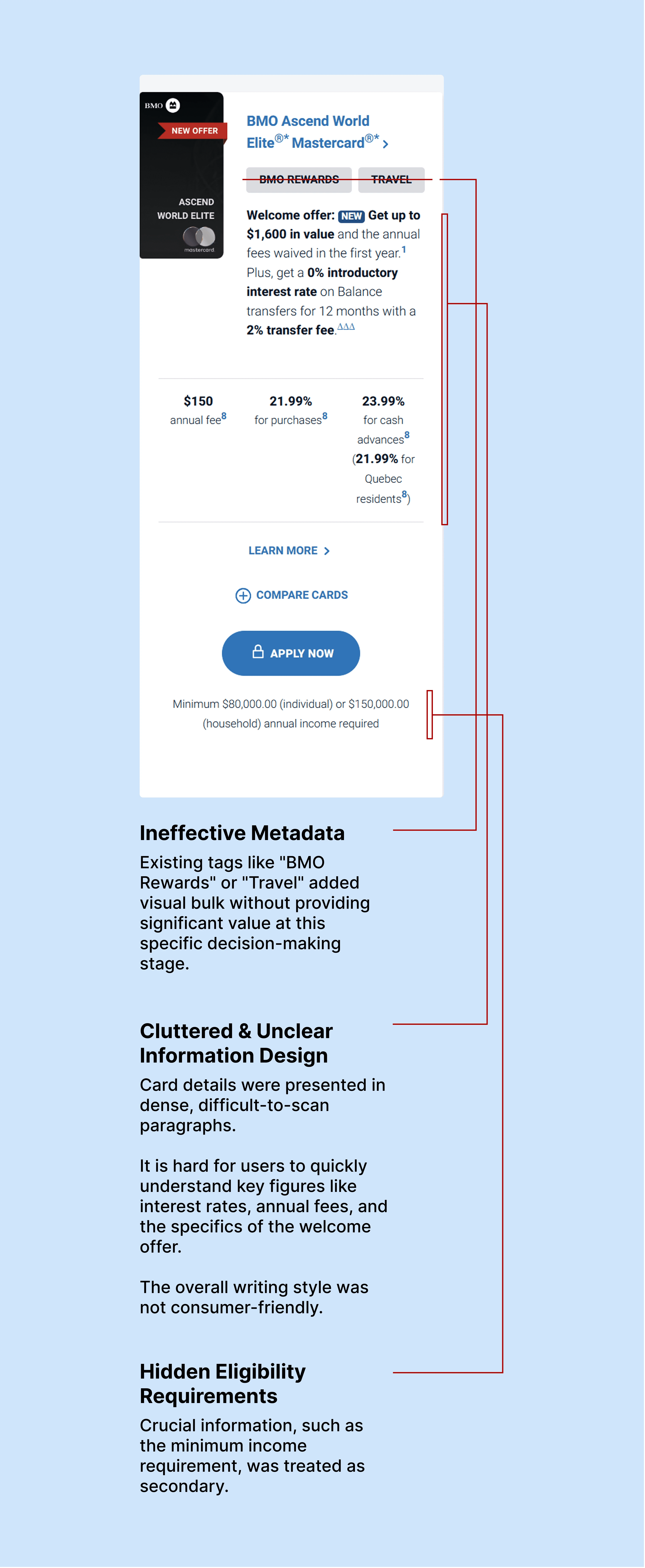
Key Issues Identified
This section suffers from several critical usability and design issues. These problems made it difficult for users to compare options, understand eligibility, and make confident financial decisions.
Process: Product Analysis & Systems Thinking
To inform the redesign, I moved beyond the surface-level UI and performed a deep dive into the product ecosystem. My goal was to understand the "why" behind these cards so I could communicate their value more effectively.
Deep-Dive Content Analysis
I didn't just skim the landing page. I meticulously reviewed the fine print and detailed documentation for each card. This allowed me to:
Identify True USPs
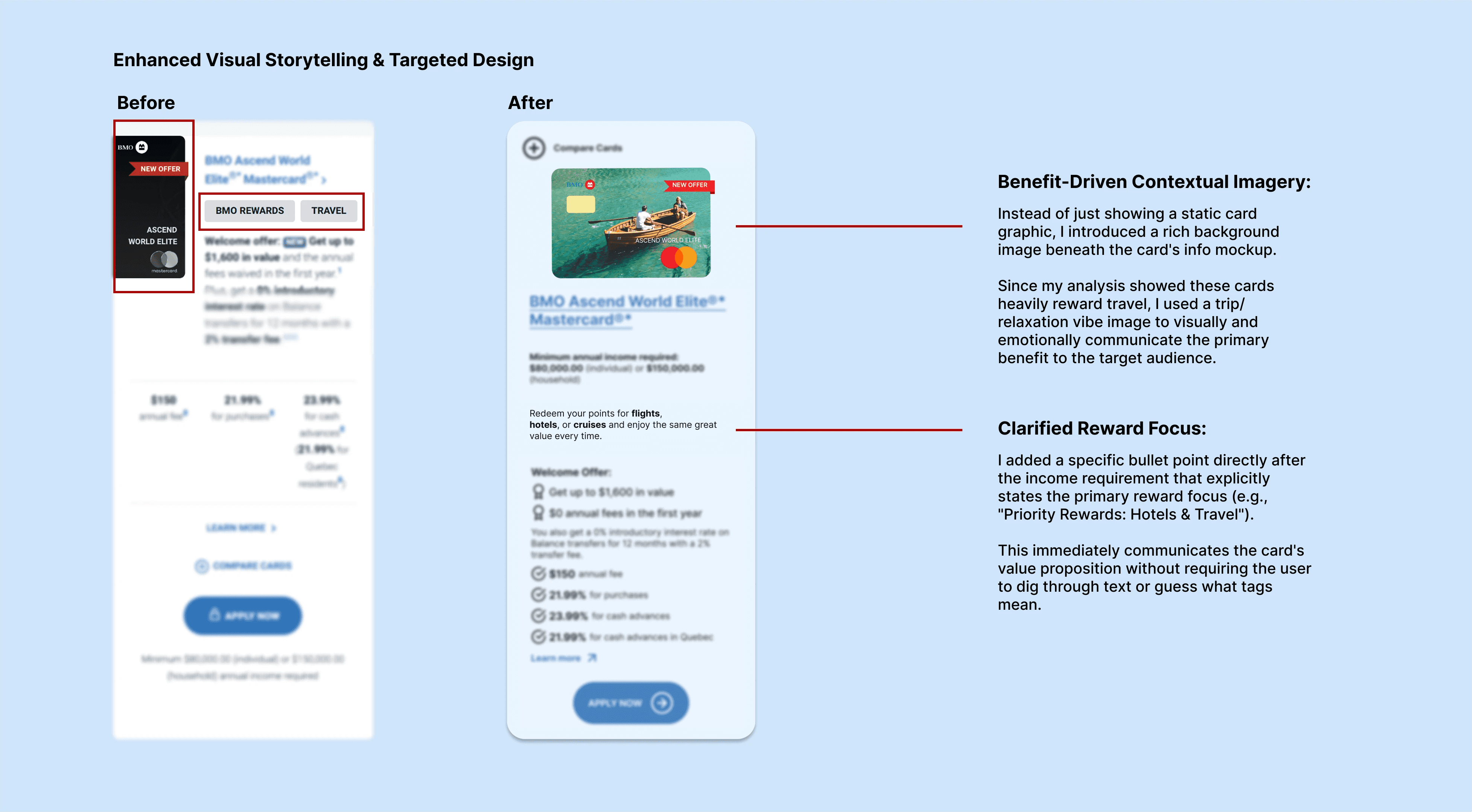
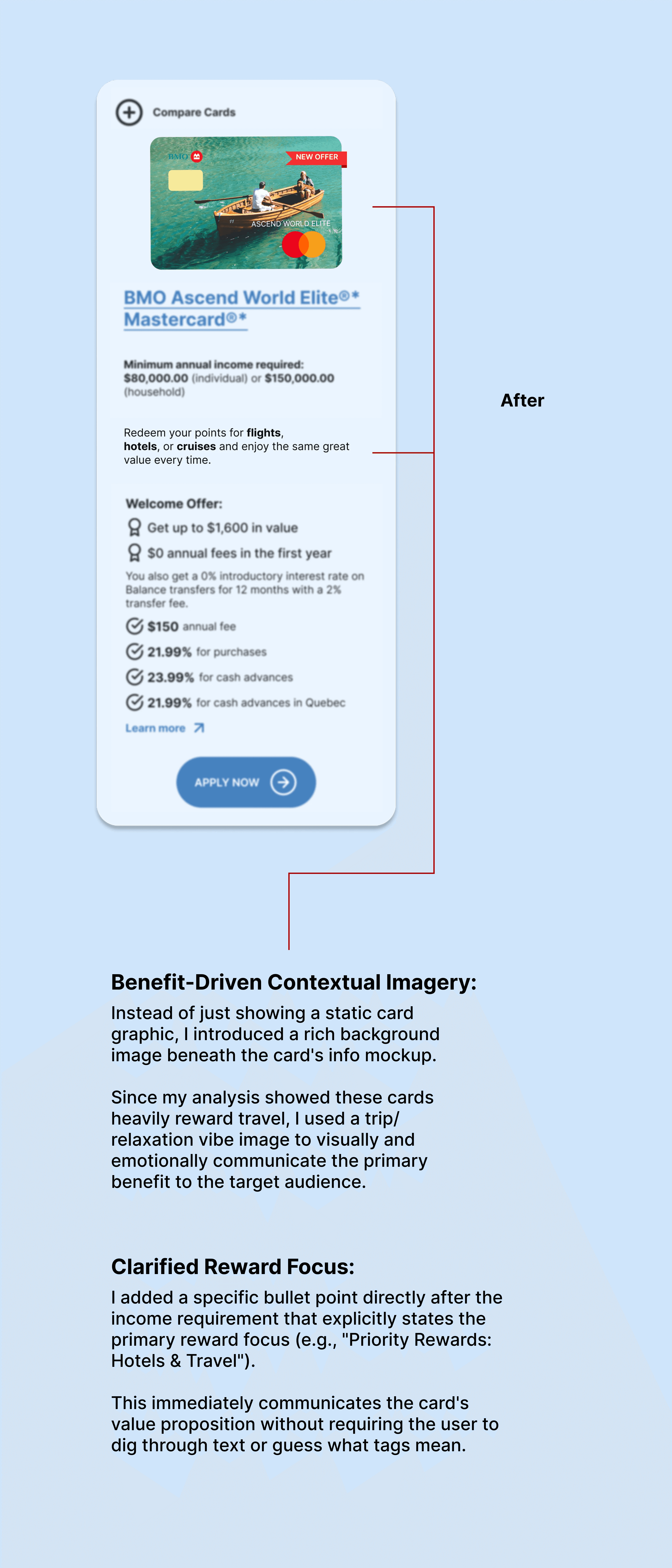
I discovered that while "Welcome Offers" grab attention, the long-term value lay in specific lifestyle rewards (Travel & Hotels).
Extract Critical Data
I identified the "must-know" info for users—specifically the Income Requirements—which was previously treated as an afterthought.
Information Architecture (IA) Audit
I analyzed how the current layout created friction. I mapped out the user's mental model and realized the sequence of information was backwards—users were being asked to "Apply" before they were told if they were eligible or how the cards differed.
Design System Execution (Figma)
Because this was a targeted, high-impact redesign, I moved directly into high-fidelity design. I focused on:
Asset Creation
I custom-built card visuals, buttons, and iconography that aligned with BMO’s brand colors while introducing a more modern, premium feel.
Scalability
Instead of just designing one-off cards, I built a modular component system. I ensured that the layout could easily adapt to different credit card types (Cash Back vs. Travel) without breaking the visual hierarchy.
Visual Communication
I introduced "vibe-based" imagery (Travel/Rest) to replace the generic dark card mockups, allowing the user to feel the benefit of the card immediately.
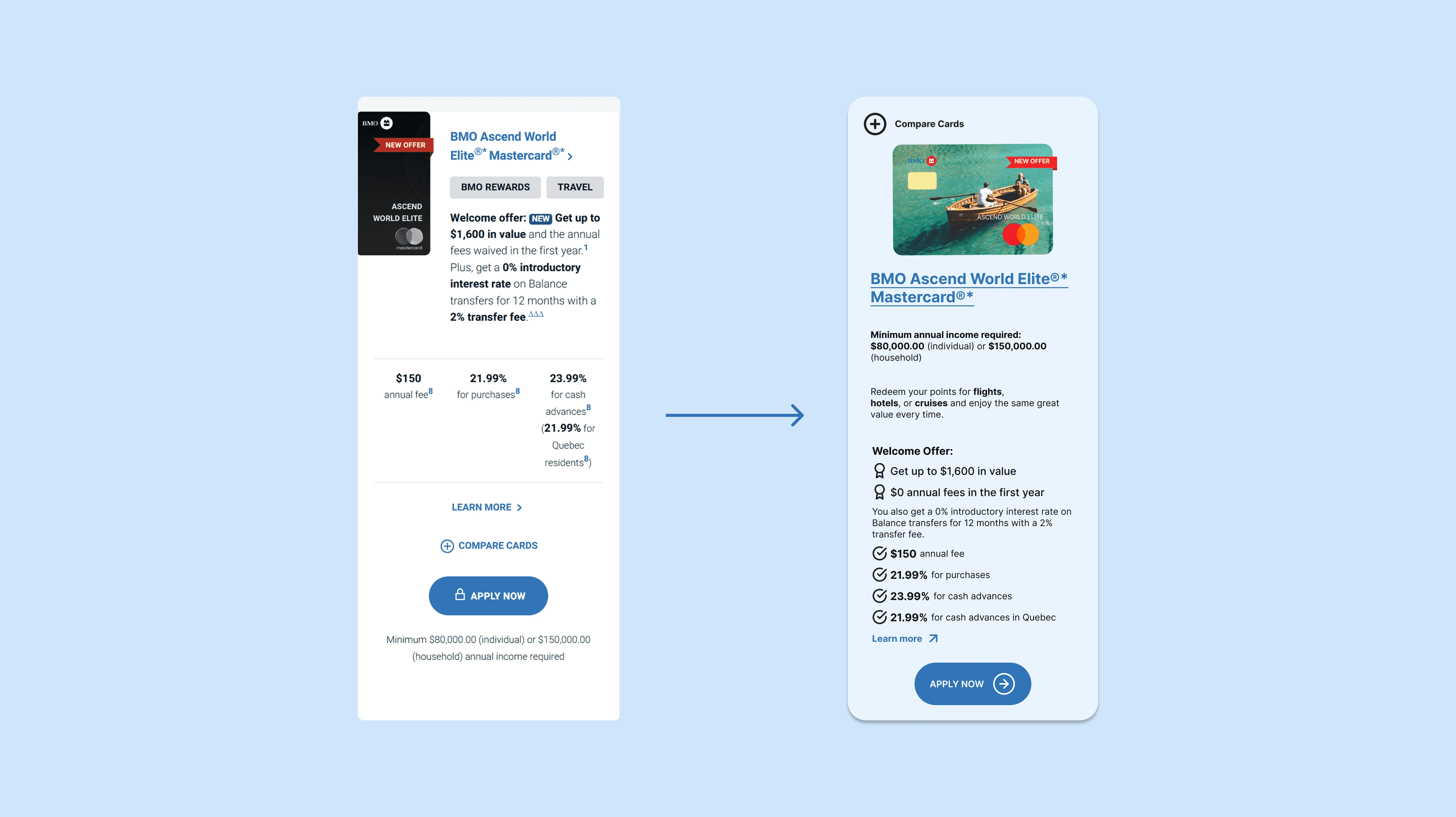
Solution: A User-Centric & Visually Engaging Redesign
The redesigned credit card cards are a direct response to the identified problems, built on a foundation of user research and clear information hierarchy.
Optimized CTA Hierarchy & Placement
I prioritized the 'Compare' tool at the top for early decision-making and isolated the 'Apply Now' CTA with increased whitespace to create a clear, high-conversion path.

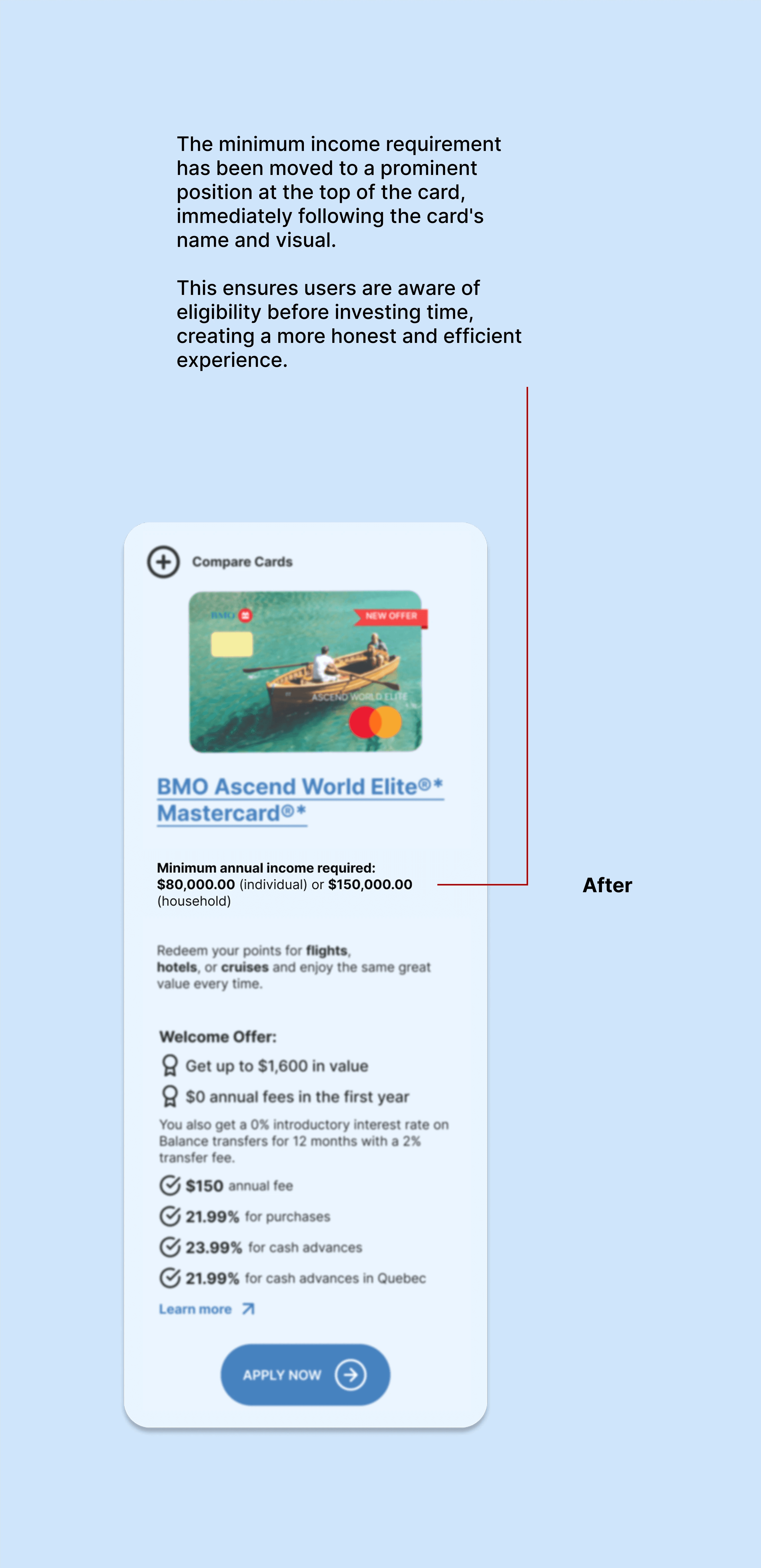
Elevated Critical Eligibility Info
I moved income requirements to the top of the hierarchy to ensure transparency and prevent user frustration by verifying eligibility before the application process begins.

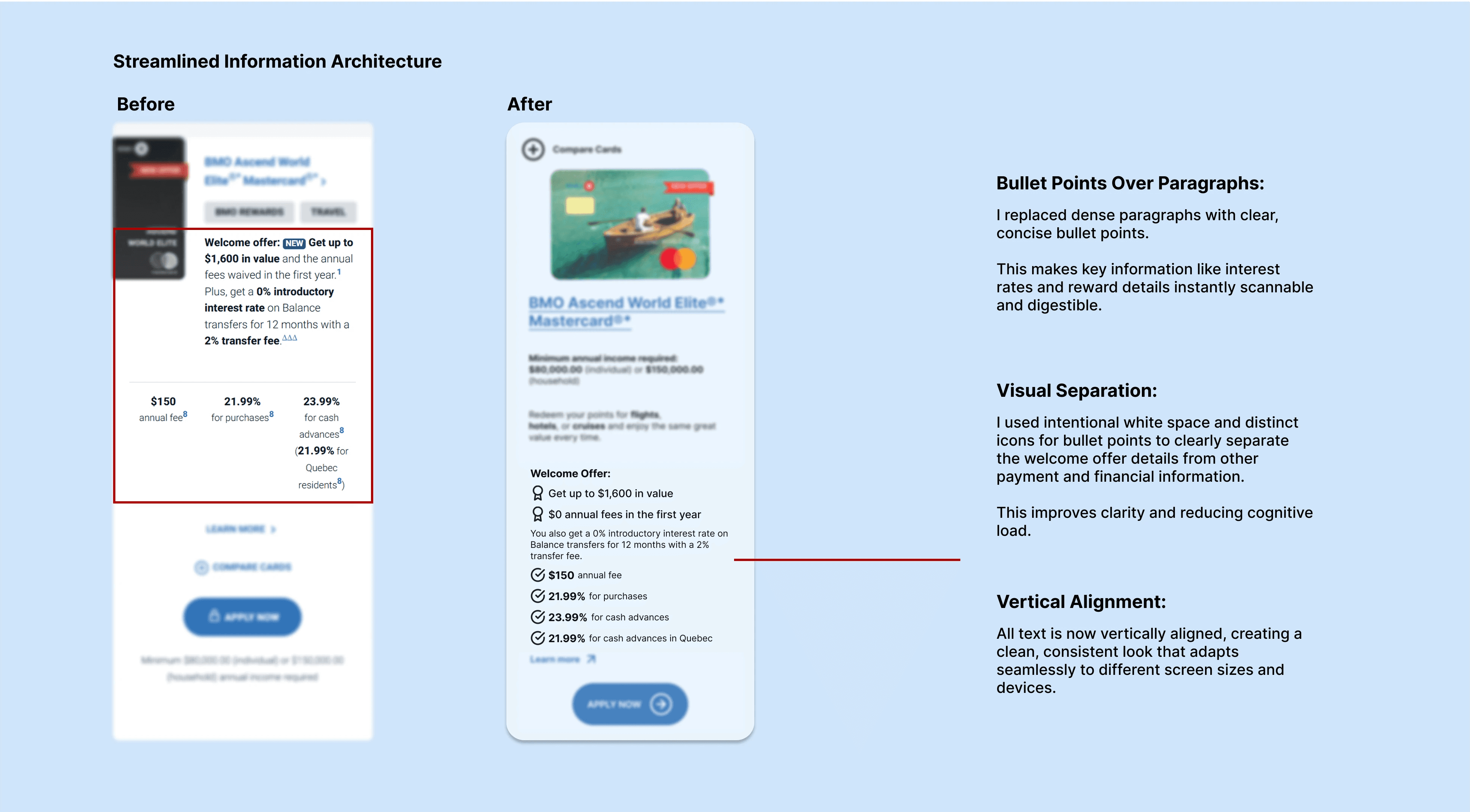
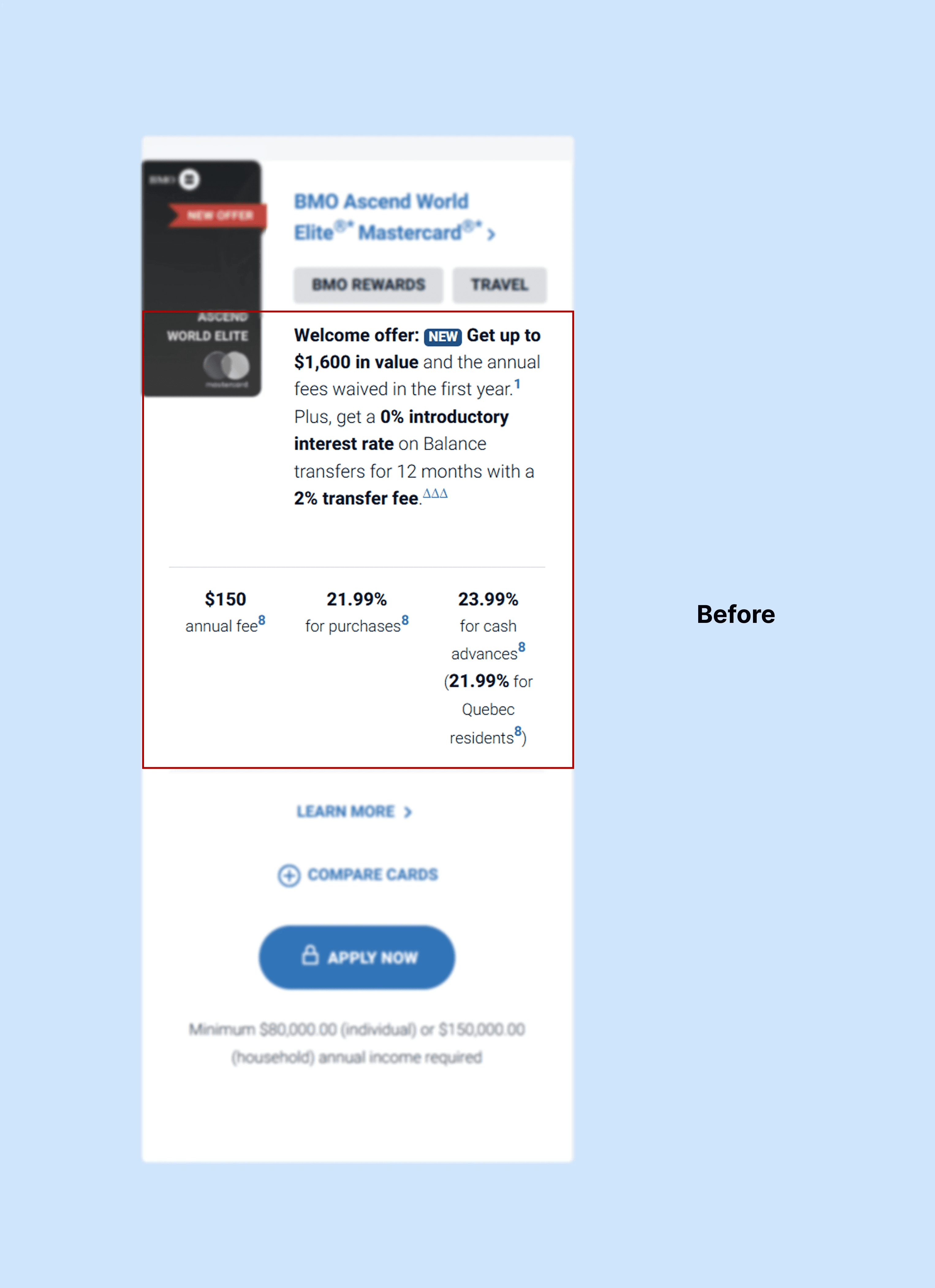
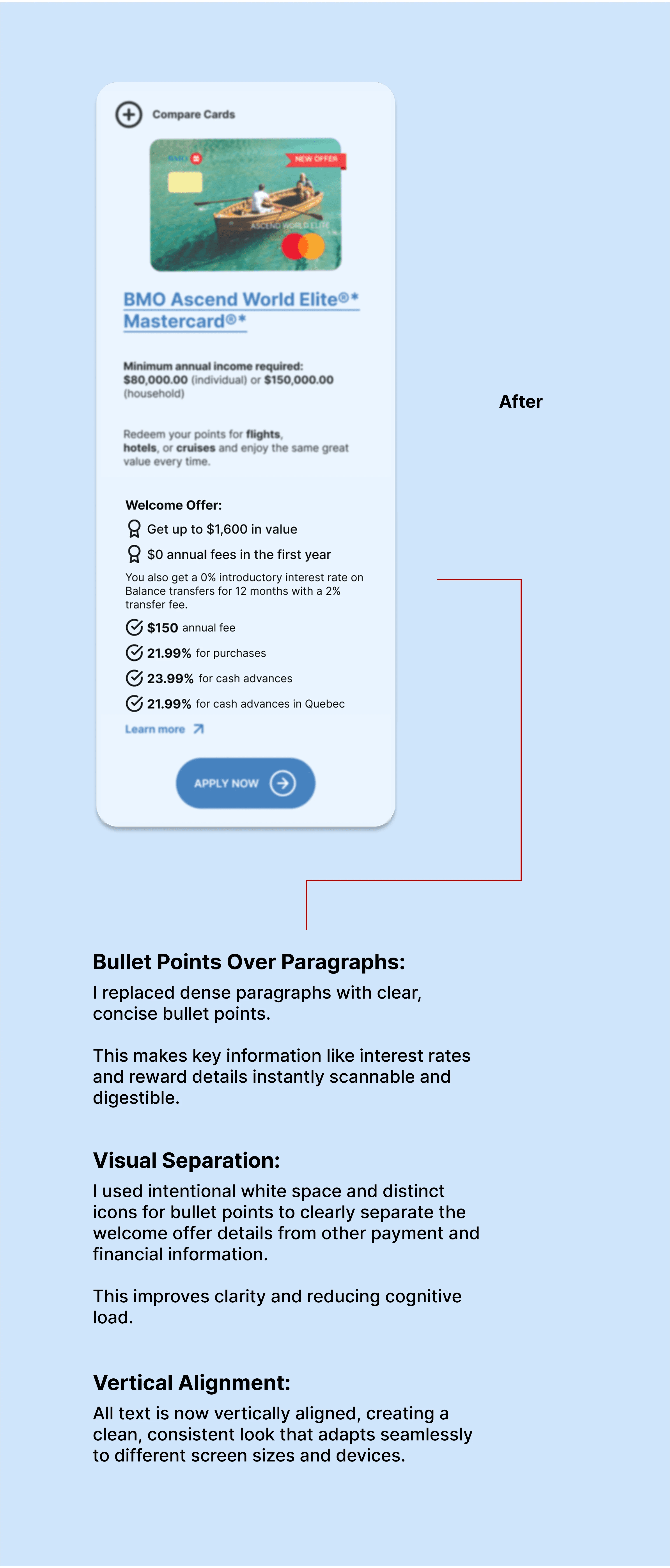
Streamlined Information Architecture
I transformed dense paragraphs into scannable, vertically-aligned bullet points with distinct iconography to reduce cognitive load and ensure a consistent, responsive layout.
Enhanced Visual Storytelling & Targeted Design
I replaced generic card graphics with benefit-driven imagery and a prominent rewards-focus tag to emotionally and logically connect users to the card’s primary value proposition.

Simplified Design & Improved Usability
Removed Cluttering Tags:
I eliminated bulky and low-value tags like "Cash Back" and "Visa," reducing visual noise and creating a more streamlined, professional appearance.
Clearer Consumer-Focused Writing:
I revised all copy to use clear, consumer-friendly language, removing jargon to make it easy for anyone to understand interest rates and reward point values.
Created a Scalable Design System
The entire card layout was built as a flexible and reusable component in Figma. Its modular structure and clear information hierarchy make it easily adaptable for showcasing any other credit card in BMO's portfolio.
Impact: Empowering Users and Elevating the Brand
The redesign is expected to have a significant positive impact on both user experience and key business metrics for BMO.
Saves User Time
By elevating the 'Compare Cards' tool and eligibility requirements and using a scannable bullet-point format, users can find the "best match" card for their needs much faster.
They no longer waste time reading irrelevant information or starting applications for cards they aren't eligible for.
Facilitates Informed Decisions
The clear, simple, and well-structured information, combined with the prominent comparison tool, provides users with all the data they need to feel confident in their choice.
This transparency builds trust and empowers them to make sound financial decisions.
Improves Conversion & Engagement
By clarifying the primary "Apply Now" CTA and removing decision-making friction, the redesign is likely to increase the conversion rate from visitor to applicant.
A better user experience will also lead to increased engagement and reduced bounce rates.
Elevates Visual Brand Identity
The addition of rich, contextually relevant imagery and a clean, modern design creates a more professional and engaging visual experience.
This not only makes the section more visually appealing but also creates a stronger emotional connection with the target audience, improving brand perception.


Reach Out with Your Questions!
If you have any questions, please feel free to contact me.
Back to Top